IKEA going from iconic…to an every day font!

identity, typography

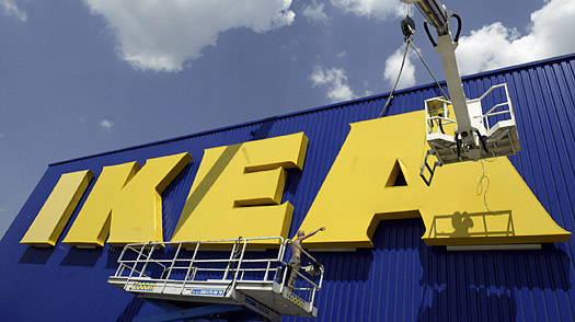
IKEA with a Futura edited font type Logo

I have to admit I really don’t like IKEA.  In fact every time I walk into that maze of a store I start to grumble under my breath saying “Why am I here…I would rather pay 20$ more in a more sane shop” But as usual I always end up going there when I need something for the house.

So with saying that I really shouldn’t care that they are changing their font from a customized Futura to Verdana. Yes VERDANA!  OK…so My husband thinks I love Verdana, and yes I do….but only for documents, excel, or emails. Why? Because we don’t have much choice on Vista!(yuck).

Verdana is a humanist sans-serif typeface designed by Matthew Carter for Microsoft Corporation, with hand-hinting done by Tom Rickner, then at Monotype. Demand for such a typeface was recognized by Virginia Howlett of Microsoft’s typography group. The name “Verdana” is based on a mix of verdant (something green, as in the Seattle area and the Evergreen state, Washington), and Ana (the name of Howlett’s eldest daughter)…….Verdana was designed to be readable at small sizes on a computer screen….. http://en.wikipedia.org/wiki/Verdana

Does the  IKEA logo look like its going to always been seen on the screen? AHHH  NO….It’s large over bearing logo that is stuck on the side of the building at least 3 stores high!

Why am I so bent out of shape when it comes to a company I obviously don’t like? Well I think its because I am understanding the loyalty to a brand.  With saying that my former company updated their logo to a more contemporary font…but I think it worked for them.  In this case its 60 years of history.  If they wanted to change it they should have taken what they had an refreshed it…not changing to to the most common font on the planet behind Times New Roman…and especially not a Microsoft font. I feel like its losing its years of originality its company identity. Its like being too cheap to spend a bit of money to hire few type designers to come up with something that everyone would be happy about?

But really I don’t care…I mean I try to avoid that damn store every chance I get…I had to buy our 2 sets of drawers from them simply due to space…and I had to buy out closets from them because they were the only ones that fit…and I had to buy my curtains from them because they were the only ones that had Velcro at the bottom so I could shorten without cutting and then take them to our next house….I really don’t like them.

“For Gods sake,  “IKEA, I will redo your font type for exchange of furniture on occasion….come on that’s like me doing this for free for you!”

Source: http://www.time.com/time/business/article/0,8599,1919127,00.html
Advertising is everywhere!

Uncategorized
Hacienda Bay, Sehel, Egypt

Hacienda Bay, Sehel, Egypt

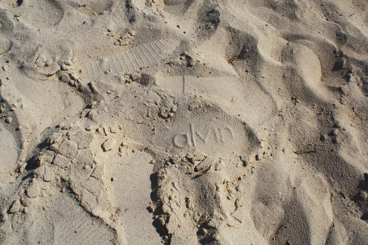
I was walking along side the Mediterranean Sea in Egypt just west of Alexandria, taking photos of the waves, the beautiful blue colours in the water, and people who just were soaking up the sun. As I was walking I looked down for a moment and saw the perfect shoe outline!

The slipper actually had the marks of Calvin! It was perfectly placed around all the other nameless shoe marks. It took me back to the movie “back to the future” when Marty is asked who was Calvin due to him boxes . I thought to myself….isn’t Advertising amazing! I mean did the marketing department at Calvin think…”oh someone in Egypt at this exclusive beach side will be marking the beach side with our Calvin slippers.”

It truly was great marketing and it made for a fabulous photo.

Smart Card of the future?

identity

0frogtroikaAfter reading a few interesting articles on identity design, I stumbled upon something that I thought was rather interesting.
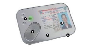
Frog Design came up with this special project for Forbes’ on special report on Identity.  They called this new form of identification “The Troika card”.   Basically it is a concept for an intelligent way to manage a social security card, turning your SIN card into a cool gadget.  It would be a mini screen that you would be able to toggle between your drivers license, passport and social security card.

After reading up on this neat concept I worried about all my personal information…what if it got lost? Well unless someone cut off my thumb while I wasn’t looking, the card is pretty safe.  The information on the card would only be accessed with your thumb print (as seen at #1).

Along with all of that…the card would be light weight, water resistant and  the screen would be super clear using some sort of  ‘super inks’ lol

I like the idea! I think it’s great to combine all your information into one, but what if it malfunctioned? What if for some reason the computer chip inside crashed?…where would the information be stored as backup? What if the malfunction was on reading my thumb print because I had a bad manicure and they cut my thumb with the cuticle clipper?…what?…it could happen!…these things are all possible…no?

(*credit to Forbes for image)

simple design

Uncategorized

signage

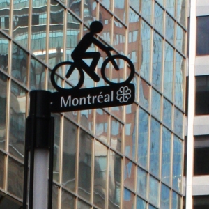
This past weekend my hubby and I went back to Montreal after several years. One afternoon as we were walking we noticed the City of Montreal had started a new bike lane. Now that is such a typical Montreal thing to do… but what was the coolest part was the signage.

They had all the paint marks on the pavement as it should be… but on the posts was this metal bike. The design was elegant and effective…no big neon signs or coloured plexi… it was simple…black painted metal sitting on top of a street sign.  Simple and to the point. I loved it!

my love for the alphabet.

Uncategorized
My favorite letter today.

My favorite letters today.

You know as far back as I can remember, I have always looked at the alphabet in a slightly different way than other people did. I remember asking my mother why was it that she named all of her three kids with names that started with an ‘S’?   I had told her that the alphabet had so many beautiful  letters, of course her reply to me was…”go play with your friends.”  Looking back, I realize how innocent that moment was.

Today we have so many new fonts that exist.  Some fonts are just simply classic and others are just a fad…only here for a short period because a company has made it popular.  I personally have seen my taste for fonts evolve over the past few years.   An interesting thought is how sometimes the letter case makes a difference.  For example, the letter ‘X’ in caps and ‘x’ in small caps: Capital X is a statement, whereas small case x is a mistake (perhaps because we have been conditioned to believe that  x means ‘wrong!’ from our  elementary school days).  I have shown you my favorite letters from the alphabet…love them all but these ones are strong…and mean something to my eye.

Regardless, the power of  letters is something I have always enjoyed to observe.   I find it helps me when I have been given a task to come up with a brand identity for a company. I will always go to the alphabet to see which letter will best describe this business.

Today the art of typology is almost gone….well,  it’s there but it’s almost become an underground art-form.   In hindsight… I wish I had spent more time to study the art-form of the alphabet and how it transcends to font developers… then again,  its never too late to learn.

the beauty of shadows

Uncategorized

the beauty of the shadow

the beauty of the shadow

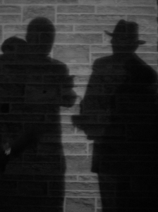
What is it that makes everyone so fascinated with shadows? Is it the mystery of the unknown? Its something that I have been wondering over the years…why is it that I love seeing my own shadow?

Orson Welles is a man who seemed to understand the power of shadows. His manipulation of shadows was so remarkable that the viewer didn’t even realize it….his art of making the shadow so second nature for everyone was incredible.  A man who understood that you didn’t need the fancy colours but playing positioning, angles and light.

I suppose the interest in shadows is the unknown…what is it? its the outline of something that we can’t touch…its real…but not tangible.

neat when we think about it.

S.